Is dark mode is essential for accessibility?

Sitting in bed. Lights out. Her iPad illuminates her face. My wife exclaims, “This website is too bright. It’s hurting my eyes!”
As I was trying to get to sleep, my initial response may have contained an expletive (sorry!). This late-night addiction to Dr. Pimple Popper had clearly gotten out of control!
However, it did make me stop and think. You don't need a diagnosed eye condition to suffer from eye strain.
Now, the simple solution to my problem would have been to confiscate the iPad. The much harder solution (as I soon discovered) was to add a dark mode theme to the Kindera website after it had already been built.
I expected adding dark mode to the site would take a day, but I was still working on it a week later. Was it worth it? Absolutely. The rest of this article explains why.
Is dark mode a WCAG requirement?
Let's start with an important question: Will I fail WCAG by not having a dark mode theme?
No, not currently. There is no specific WCAG 2.2 Success Criterion that mandates a dark mode theme.
The inclusion of dark mode remains a best practice and a method for meeting the broader intent of WCAG (User Preference and Flexibility), but it is not a Pass/Fail requirement under any single criterion.
So, why add it?
To keep my wife happy, of course. She is very persuasive! But truthfully, she is not alone. Many people prefer dark mode—in fact, it's often one of the most requested features for any new app or website.
Adding a dark mode theme can be beneficial on multiple counts:
- It can reduce eye strain and glare.
- It extends the battery life on mobile devices (especially those with OLED screens).
- It significantly improves accessibility and user comfort.
However, the harsh truth is that you cannot simply push a button and suddenly create a perfect dark theme. It requires careful thought, a designer, and a developer. Luckily, I am capable of all three!
The challenge of careful design decisions
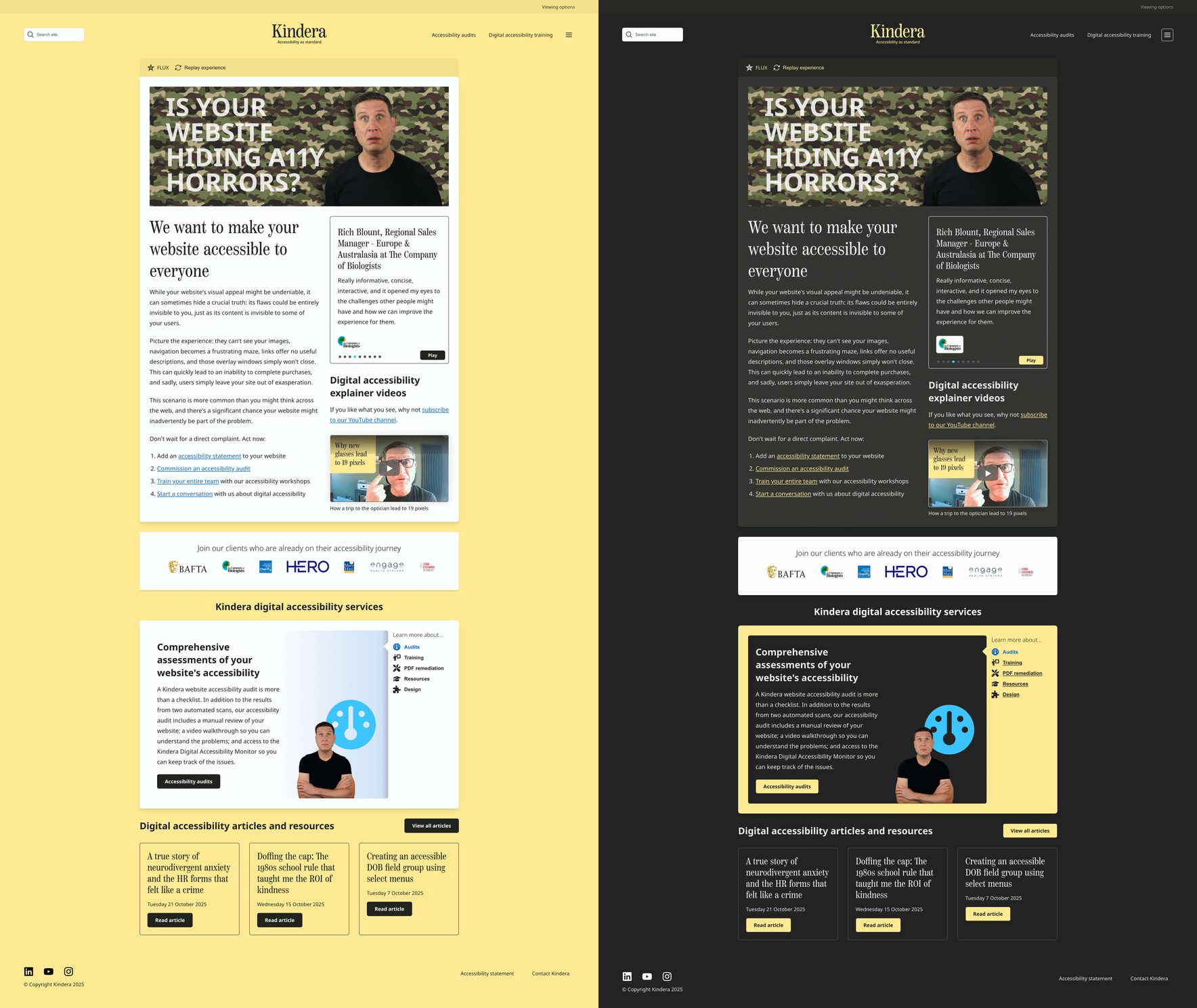
A dark mode colour theme is not as simple as changing everything to be a paler shade of grey. It requires careful consideration to ensure the integrity of the brand. When a user visits the Kindera website, it still needs to be recognisable as Kindera, no matter the theme selection.
Thankfully, the Kindera colour palette was chosen carefully from the outset to avoid one common accessibility mistake: using a dark background colour that is too dark (e.g. pure black #000000) combined with a foreground colour that is too bright (e.g. pure white #FFFFFF).
While this combination maximises contrast, the difference can sometimes be too jarring for some users.
At Kindera, we use two off-black background colours (#222222 and #333333). Paired with off-white text (#EAEAEA), we can maintain the required 4.5:1 WCAG contrast ratio while providing a softer reading experience.
Using these colours alone would provide a very drab experience, but punctuated (in appropriate places) with our brand yellow and blue, things begin to look a little more vibrant.
Although we had all the correct ingredients, it's important to state that it was more difficult than you would think to select the right colour pairings to create a balanced look—all whilst maintaining the original goal of creating a softer reading experience.
Respecting user choice with smart functionality
In addition to a great design, I wanted the website to achieve two things:
- Respect the user’s operating system Appearance preferences.
- Provide a theme switcher that allows the user to choose between a default light theme and a well-designed dark theme.
I achieved this with a combination of Tailwind’s built-in support for dark mode and some JavaScript. By offering this choice, we cater to the largest possible audience and uphold the core principle of accessibility: flexibility.
Who benefits most from dark mode?
Adding a dark mode theme is not a vanity project. Apart from my wife, there are specific users who will greatly benefit from this feature.
- Photophobia: People with light sensitivity find dark mode essential to use screens comfortably, preventing headaches and physical pain.
- Migraine sufferers: Dark mode can significantly reduce the light trigger that contributes to or worsens migraine headaches.
How dark mode helps users with specific disabilities
Dark mode can also benefit certain users with reading or learning differences:
- Irlen syndrome (Scotopic sensitivity syndrome): Many individuals with Irlen Syndrome find that white pages with black text create a visual disturbance or "glare", making the text appear to move or blur. A darker background can stabilise the text and improve reading comprehension.
Both my daughters suffer from this condition, so that means I am making three people in my family happy by adding a dark mode theme.
- Eye fatigue: The reduced contrast and minimised glare help prevent eye strain during extended reading sessions, which is especially helpful for neurodivergent users who may focus intensely on text.
When dark mode can cause issues
As with most things in life, one size does not fit all. There are some users with Astigmatism who may find the dark theme uncomfortable.
People with astigmatism often find it more difficult to read light text on a dark background. The light text on the dark background can appear to "bleed" or "bloom," making the characters harder to define and focus on. These users typically prefer the traditional light theme (dark text on a light background).
That’s why it is so important to offer choice.
A few trip points when adding dark mode
As I said, creating a dark mode theme wasn’t straightforward. Here are some key decisions I made during the implementation:
- Media borders: Add a light border around media like images and videos to ensure they stand out on a dark background, as you never know the colour of the image content.
- Third-party logos: Logos will vary in shape, size, and colour and typically can only be presented on a white background. You may need to use a distinct background block or offer a light-only version of the logo in the dark theme.
- Switcher location: The location of the theme switcher needs careful attention. It should be one of the first items presented to a user, but this can get in the way on a mobile viewport. To avoid the theme toggle occupying too much space on mobile devices, we hide it once a choice is made (it can be re-accessed via a menu).
- Final checks: Finally, be careful to check colour contrast for your new dark mode theme. It is still important that everything meets the minimum WCAG requirements.
Dark mode rocks!
I like the new dark mode so much, I've left it (for now) as my default view mode.
My wife is much happier. My daughters are ecstatic (well, that’s an exaggeration on my part as I have not asked them, but I hope they are!). Hopefully, new visitors to the Kindera website are happy to have the choice.
What do you think? Try enabling dark mode on the Kindera website and let me know your thoughts.
Simon Leadbetter,
The Accessibility Guy at Kindera
